
Philosophers, psychologists, and neurologists interested in the nature of visual perception long ago noticed a phenomenon that has come to be known as “size constancy.” Size constancy, according to the American Psychological Association, refers to the perception of an object “as being the same size despite the fact that the size of its retinal image varies depending on its distance from the observer.” That is, as objects approach us or recede from us their image on our retina increases or decreases in size respectively.
Size constancy is only one aspect of what the APA refers to as “perceptual constancy.” Other aspects include what they refer to as “brightness constancy,” “color constancy,” and “shape constancy.” Each of these aspects of perceptual constancy has presented a challenge to visual artists who wish to work in the realist tradition. Shape constancy is addressed in teachings on “perspective.” A building may appear square to an observer but artists need to learn that as it recedes in space the lines that comprise the outline of the receding portion move closer together.
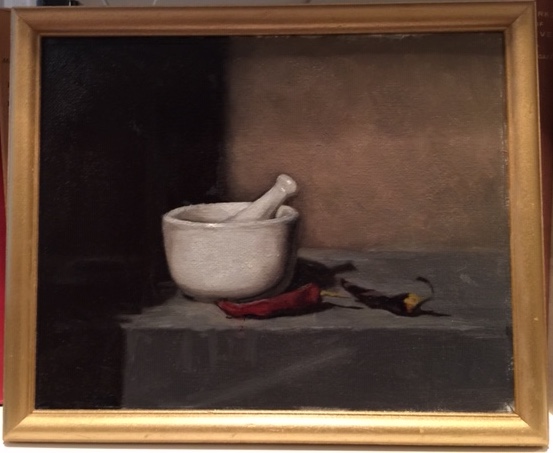
“Brightness constancy” and “color constancy” are less well understood. In fact, these designations are arguably misnomers. “Brightness” can be correctly predicated only of objects that actually emit light, but most objects don’t do that. “Value” refers to where on a scale of darkness or lightness a color, including black, falls, hence “brightness constancy” is more properly identified as “value constancy.” “Color constancy,” by the same token, is more properly identified as “hue constancy” in that “colors,” as generally understood, can be broken down into multitudes of subcategories artists refer to as “hues.” Red, for example, can be broken down into a variety of hues, some falling under the category artists refer to as “warm” because they are closer to the yellow part of the spectrum (e.g., cadmium red and vermilion) and others under the category artists refer to as “cool” because they are closer to the blue part of the spectrum (e.g., alizarin crimson).
In fact, value and hue constancy overlap. The artist Frank Arcuri explains to his students that natural light is cool and that this means it “washes out” color, so the portion of an object on which light falls most directly will have a lower hue saturation than the surrounding area. Areas of an object that are lit directly are thus both lighter in value and different in hue. As the object turns away from the light the color saturation increases becoming first warmer and then, eventually also darker.
Objects are also always illuminated by both direct light and the light reflected off other objects. This reflected light is influenced by the color of the objects off which it bounces so even what appears to an untrained eye as a purely white object will, in fact, have portions where it is not purely white. The difficulty is that such objects will appear purely white to most observers because the brain “corrects” for these tiny variations in hue to produce a visual impression of a uniformly-colored object.
Artists have been told for generations to “paint what you see.” It should be clear now, however, that such advice is counterproductive. What the untrained eye “sees” is something like an interpretation by the brain of the information provided to the visual cortex. Visual perception is a far more complex process than is generally appreciated. This process by which the brain produces it needs to be deconstructed by those who wish to learn how to paint realistically and this is not an easy task because the brain does its “interpretations” automatically.
